Check it out!

Wherein I share my sad tale of woe that others may be spared : P
Now, I love shopping on-line. I really do. And I shop on line a lot.
I’m frequently asked where I get my fabrics, accessories and the like. Truth is I get them all over the world, because when I’m working on a project I’ll spend countless hours hunting down the most “right” materials I can find. Both heaven and hell are in the details:)
Most of my on-line shopping experiences have been good. I was thrilled with the dozens of TINY BUTTONS I bought on Etsy from lovely Anna in Poland. I’ve had some amazing high end silks from SARTOR in the Czech Republic. You can’t beat the reasonably priced castings at ARMOUR and CASTINGS. These are only a few, and I’ve been an ebay and etsy shopper for years too.
None the less, on-line shopping has its risks, and even a very experienced shopper can run into trouble.
The single worst experience I’ve ever had happened late last year.
I was sourcing fabric for my upcoming Saxon Gown project and thought I’d found some good choices at Puresilk.us, an online retailer from India. They also go by quite a lot of other names including The Fabric Factory, Royal Indian Brocades, Executive Silks, and maybe others, so you must be wary if you’re to avoid them.
I like to know who I’m dealing with on line. So I started to search for reviews. I stopped looking when I found that a well known pattern maker and costumer highly recommended them. Great! I thought, I’ll go ahead and order.
I spent a total of $150US for “samples” of four fabrics (three at a yard each, and one three-yard piece).
The first thing that went wrong was they didn’t actually have one of the fabrics, despite it being listed as in-stock when I ordered. I ended up choosing an alternate that was $18 cheaper. They promised to refund the difference…..more on that later.
I waited for a few weeks, and then, oh frabjous day! The order arrived! On Christmas Eve! Like it was from Santa! What could be better! Alas, like finding a lump of coal in your Christmas stocking this is what happened next:
One fabric was the wrong colour entirely, which was annoying, but the other two seemed workable. I’d intended to over-dye one of the samples to get the colour I wanted, so I immediately ran off to get my dye supplies (because who doesn’t spontaneously dye fabric on Christmas Eve?) I popped it in to the dye bath and waited….checked it…waited…..checked it…waited……….after well over an hour, the fabric came out of the dye bath completely unchanged. That’s when I became suspicious and the real trouble started.
I got out my lighter and burn tested it. Not 100% silk. In fact little to no silk content at all. The same proved true for the two others. When the fourth piece of fabric arrived a couple of weeks later it also was synthetic.
One fabric mislabeled with wrong fiber content is possibly a mistake,
BUT ALL FOUR?!?!

Here is a link to a video of me burn testing the fabrics. A videographer I am not, but it does clearly show the results of the burn test. I’m lucky the fire department didn’t have to come. As for my cat in the background, no she wasn’t being tortured, she always sounds like that, she’s part siamese.
And here is the email string (read bottom to top). I especially like the part where they try to blame it all on poor workers in remote villages. Nice.
Although they eventually promised to refund me, they never actually processed the refund. That’s when I went to my credit card provider for help.
First I had to report the case as fraud to the RCMP. Then I had to get an expert to verify in writing that the fabrics were in fact not silk (not actually easy to do). Then after sending all of this paperwork etc. to VISA, they were able to get me my money back. It was almost more trouble than it was worth, but there was no way I wanted to let Puresilks.us keep my money.
Is this a happy ending? No. Not really. Yes, I have my money but no fabric. And they cost me my time and have delayed my project.
I post this in the hopes that you may learn from my sad tale, sewing friends.
Let my pain save you from a similar fate 🙂
P.S. I contacted the costumer who recommended this company to tell them what had happened. They would not hear of it. They defended the company, and when I continued to suggest there were issues, simply blocked me.
Were I in their position, I’d certainly want to know. I’d be worried about tarnishing my own reputation by recommending a company like this one. But, I guess no one likes to get bad news. If I’d been singing the praises of a supplier to others, and made some expensive costumes out of their fabric thinking it was silk, I might not have wanted hear this either. I’d probably be embarrassed at having been mislead. But it could easily have been me too, if I hadn’t tried to dye the fabric I might not have caught on either.
Posted in Uncategorized | Tags: B.R. Exports, fake, Puresilks.us, review, silk, Warning
If you’ve read some of my previous posts you’ll know that I place a certain amount of importance on getting the objects I make to look and behave reasonably like those pictured in art work of the period.
Too often, when someone makes a garment or other object, and it doesn’t really look “right” the accepted explanation is that it’s because what’s shown in art is stylized; that the real thing didn’t/couldn’t really look like that.
It is after all, a pretty convenient excuse. But just because I can’t get something to look right, doesn’t necessarily mean that the issue is with the artist’s work and not my execution. That’s why I try not to rely too much on this fall back.
For example, let’s say I make a Tudor gown and the bodice isn’t smooth like those in portraits but instead wrinkles across the body. I could say “well the artists made them look smooth, but in reality fabric just doesn’t behave this way, it would actually have had some wrinkles”. But the truth is I’d have failed to understand the amount of structure in a garment like this compared to a modern dress. Had I interlined the fabric properly, I could have made it look every bit as smooth as they look in the portraits.
All that said, it’s also very important to understand that I don’t take everything I see in drawings or paintings as completely literal, far from it.
Artwork in the 15th and 16th centuries was certainly quite stylized, but that doesn’t necessarily mean the clothing didn’t look in essence as it is depicted. There is often a sort of “core truth” to the images that emerges when you survey enough of them.
I am careful to consider the subject of art. Is the figure I’m looking at a portrait of an actual person, or is it an allegorical figure? Is it a person depicted supposed to be from a foreign culture? When it comes to saints and foreign people, there is much greater risk that the artist may have dressed them fantastically, rather than the actual fashions of the time. I am highly suspicious of single examples; if a dress is the only one like it I can find anywhere, I will generally not make it the focus of a project, even if I really love it. My overall objective is always to make the most plausible examples.
At the beginning of a clothing project I start by amassing a sizeable file of images which, when available, includes: pictures of the garment I want to make; those from other nearby cultures in the same time period; those from the period(s) leading up to the one I’m working on and; those that followed. Fashion particularly tends to become more understandable when viewed in the context of its evolution instead of just as a moment in time.
Once I’ve got a file of images, I’ll generally spend several weeks looking at them over and over again on a daily basis. I’ll try to notice details, differences, similarities. Before I ever get to the pattern and cutting phase, I will have reviewed my images literally hundreds of times, and sewn the gown in my head over and over.
Eventually I reach what I would describe as a sort of “magical moment” when I’ll suddenly feel that I REALLY understand the essence of the dress, how it evolved, and how it lead to the fashions that followed.
Then….. I get my scissors 🙂
Planning and Research Phase
The Politics of Fashion – Wherein I read something and end up with a biene in my goldhaube.
Recently and quite out of the blue I developed an interest in the gowns associated with the early renaissance in the Electorate of Saxony, most often referred to by costumers as “Cranach Gowns” after the Lucas Cranach and his followers who painted so many portraits showing this style.
So, needless to say, I now have to make one.
As part of the planning phase I’ve naturally been examining many of Cranach’s paintings as well looking at the diaries of others who’ve attempted this dress.
I’ve also reviewed Reconstructing History’s comments and pattern for the gown. You can read RH’s analysis here.
RH puts forth some decided opinions on who should and shouldn’t be wearing this dress, which of course got me thinking.
RH tells us:
“one of the aspects of historical costume that we [as re-enactors] most often ignore is age-appropriateness….”
“Another thing we often ignore is body shape. Some types of clothing aren’t shown on all types of bodies…. the fact that we never see long lanky women in some of the Venetian styles nor big-breasted women in Cranach Gowns is a fact that cannot be ignored.”
“…Cranach’s Saxon Gowns are one of those youth-specific gowns….[this] style of gown painted so often by Lucas Cranach was the fashion of young ladies and if more mature, more fully-developed and well-fed bodies will not fit into it, I do not find this to be a surprise.”
Let’s examine these ideas.
First, let’s say you accept that, based on Cranach’s art, only young slim women wore this fashion. Following this logic, you might also have to draw the conclusion, based on most European art of the time, that plus sized people, unattractive people and old people were actually quite scarce.
Based on seeing similar gowns on similar body types painted by several artists, RH rejects the idea that “the subjects of portraiture are like fashion models” or that there’s “an ideal body type, and the painters make everyone look like that”.
The problem is, even when you look at paintings by different artists working at the same time in the same geographic area, you can be hard pressed to get away from a certain body type. Do some reading on art and you’ll soon see artists described as being from a particular “school” and/or as following a specific style.
Often those of the same school would have similar ideals, and would follow each other’s work. It’s a false assumption to conclude that just because you see the same style of gown on the same body type by more than one artist that it must mean only that type of person wore it. What it really means is that the artists shared the same idea about what was an ideal body.
When you really think about it, it seems an implausible notion that all women living in 1500’s Venice must have been uniformly robust, buxom and curvy, yet it’s true, you’ll not see a slim women in those fashions.
So why not? Did they cast all the skinny girls into the sea? It’s probably safe to assume there were at least some skinny women living in Venice at the time. Did they wear some other fashion, better suited to their body type? That seems highly unlikely, the more obvious conclusion is that they (unhappily?) wore the fashions of the time anyway, because…..those were the fashions of the time…. regardless of not being able to live up to the ideal.
That’s also what still happens today. Go down to the mall for an hour, you’ll see versions of the current fashions worn more or less successfully by various people of all shapes and sizes. Where you will not see such a wide array of body types, is in magazines or ads. There, much as in historical art, the vast majority of images are of those with what’s considered to be ideal bodies. If, 500 years from now, you based your idea of what most people wore and looked like today on magazines you’d think we were all young and thin too. This is the real fact that can’t be ignored.
The cult of beauty has very deep roots. Ageism and body-idealization are hardly new ideas. Sad to think that hatred of our own bodies is something we might well share with our long-ago sisters.
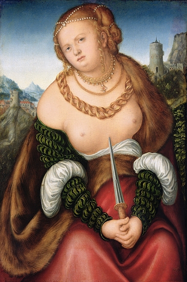
This is the look you get when someone says
“The gowns are only ever seen on young women of slight build with very small breasts”
Not all that small breasted…..
Secondly, were Saxony gowns youth-specific? As in every age, the very flashy new high fashion gowns were likely worn first by the young and very wealthy. None the less, more moderate depictions of the Saxon gown, with many of the same elements (slashing, guards, stomach-lacing) do exist.
This lady appears to be more mature, and her figure is more average than most of Cranach’s racy young women, yet the gown has all the typical elements. I quite like her, she seems a very real person.
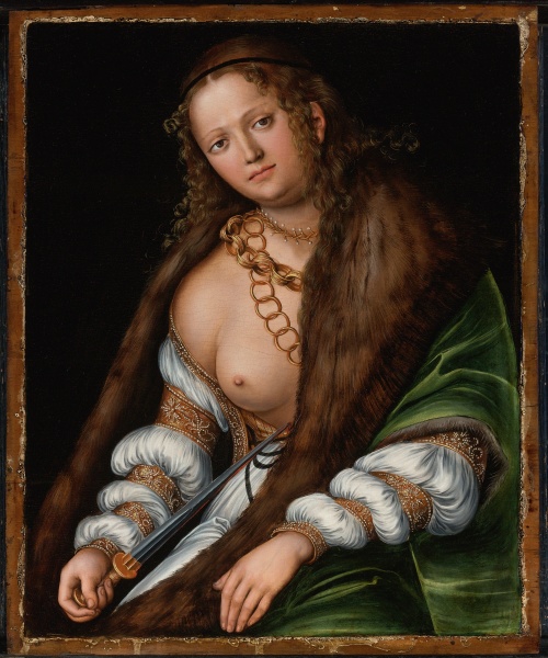
This lady too seems more mature. Like the other lady she wears a small cape (gollar) over her dress for warmth
In Cranach’s series of “Ill-matched Lovers” paintings, the portrayal of tooth-shaken old women dressed in Saxon gowns may indeed be intended to show that the women are dressing too young for their age. But if that’s true, why aren’t they wearing the same flashy gowns the younger women wear?
The old women’s gowns are decidedly plainer. The sleeves are simpler with no puffs or slashing, they wear plain headdresses, the gowns lack the amount of gold guarding worn by the younger women, and yet it’s still essentially the same dress. Arguably, this may mean the dress was worn by older women, just in a sedater, more age or widow-appropriate form.


In general portraits of older people, especially women, are harder to come by. It would be perilous for me to draw definite conclusions without an extensive survey. None the less, in at least some of the portraits of older women I’m aware of, such as Memling’s Portrait of Old Woman, or Van Eyck’s portrait of his wife Margaret, we see they are dressed in versions of the current fashions.


Lastly RH suggests that as re-enactors we should only chose fashions that fit our age and body shape.
I agree with this…… provided your entire goal is to look like you stepped from a portrait. If you are lucky enough to have the body type idealized in an era, the effect can be very satisfying.
If you can, wearing clothing that celebrates the shape you are is wonderful. My small breasted protruding-lower-belly shaped body, which has been a misery to me most of my modern life, was adored in 15th century, it’s one of the reasons I was drawn to 15th century fashion in the first place.
However, it remains that the vast majority of people depicted in medieval illuminations and portraits are both young and fairly slim. This could really limit your choices. Yet, we know for a fact not absolutely everyone died before 30, and it’s reasonable to guess that some skinny women lived in Venice and some plump curvy women in Saxony.
Perhaps as re-enactors we should consider, not just the ideals of the time, but how those ideals would translate to real, everyday people. Instead of suggesting that people who do not possess the “right” body for a time period shouldn’t wear its fashions, it’s more interesting to consider how you could and should adapt those fashions to your body, just as someone with your body would have had to do if living at the time.
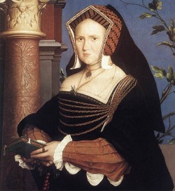
I think Mary Wotton would agree
Posted in 16th Century, Costuming, Saxony | Tags: 16th century Saxon German, Cranach Gown, SCA Costuming
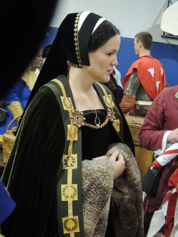
I really like this gown.

So I made one. That’s it:)
This is the hat – I’m pretty happy with the way it turned out

I don’t have a good pic to the dress unfortunately – in most of them I have a mantle over it – maybe someone else will have one.
Here I’m trying to figure out how to get up from my knees while wearing 15lbs of velvet, silk, and fur.


Here I’m doing Dr. Evil for some reason
 I’ve been pondering this hood for the past couple of years and even made several different patterns for it. Frustratingly, none of them ever looked quite like those depicted in illustrations.
The explanation often given for this problem is, “it’s the artist’s conception, it didn’t/couldn’t really look like that”.
I’ve never been comfortable with that reasoning.
Artwork in the 15th century was certainly stylized, but that doesn’t necessarily mean the clothing didn’t look essentially as it is depicted. I never like to assume that because I can’t get it to look right, that it just wasn’t so! Extant examples of clothing are rare; art is often the only clue we have. Dismissing it removes one of the few means we have to determine the success of a project.
It arguably gives more insight into “what was” if an object is made using period-plausible methods and patterns AND the result looks reasonably like those depicted by its contemporary artists. It’s also pretty exciting when it happens!
This brings me back to the mystery of this particular hood. Someone recently told me they thought it must be simple; just a piece of cloth tied around the head. That’s the same theory I’d been working with all this time. Her comment also made me recall a lady at Pennsic telling me the she believed medieval people would have done “whatever was easiest” to achieve a result, and this got me thinking.
Many extant objects tell a much different story. In our busy modern age we tend to be convenience-driven, much more so than our medieval counterparts. Consider as just one set of examples, the extant clothing finds from Greenland. Far from being “simple”, or made the “easiest way possible”, many show complicated cutting layouts, extensive seam finishing, and even unnecessary false seams added, presumably, for the sake of symmetry. The makers appear to be more interested in esthetics than ease or simplicity.
With this in mind I chose to approach the hood from the opposite perspective. I gave up simple.
My two new objectives were:
-I wanted a pattern that could be made with little-to-no wasted fabric.
-I wanted the finished result to look like the artwork examples.

The characteristics of the hood as shown in artwork examples are:
The crown is rounded and fits smoothly over the back of the head

The front edge is chin length or just slightly longer; it can be wider with a turn-back or not.

The “ties” are only long enough to tie on top of the head or overlap slightly, they don’t wrap back around the head.

The ties are wider in the back and gather or taper down to being narrower by the time they meet.

Lastly, the look I want most to achieve, the ties follow a gathered “swoop” from the back to the front without sticking out or being too bulky.
 Swoopy!
After two years, three completely different designs, four minor variations, many cups of tea, and at least a dozen more grey hairs, I finally hit on a design I think really works.
It fits well, is comfortable, doesn’t slip off my head, makes excellent use of fabric with zero waste, and ……….looks like the art! Yay! 😀
It IS more complicated than just a piece of fabric tied around your head, but in the end it’s still fairly simple and works up very quickly – I can make one in just a few hours: Here is the pattern!
Final pictures and a photo diary to follow.
I have to take some better photos of this but here’s one – the crown has come untucked so it doesn’t look the best.
 Update! I’ve added a few more photos which are hopefully a little better:


Here is an alternate pattern/layout: 
The last costrel I made was an attempt at reproducing a tiny lovely little example held by the Museum of London, measuring only 4”x3”. So now, why not head for the other extreme? I became interested in this huge one from the Ashmolean Museum Oxford when I first came across it doing a Google image search.

Tudor Costrel belonging to the Ashmolean Museum Cambridge
Its measurements are given as 16” long and 13” tall by Oliver Baker in Black Jacks and Leather Bottells.
I have a another good photo of it which I believe came from one of John Waterer’s books, either “Leather in Life” or “Leather and Craftsmanship” although I can’t be certain as I neglected to label the photo copy. The plate gives it as being 16” long as well, although the information may well be second-hand from Baker.
So far, I have been unable to determine a few things:
-How deep the costrel is
-How thick the leather is
-Whether or not it has an extra layer of leather in the handle, or around the ends
Baker also contains a few paragraphs about large costrels including part of a poem “Farewell to the Tower Bottles” by John Taylor, poet, waterman, and apparently disgruntled former wine-collector of 14 years.
John Taylor. Not happy, not happy at all.
The tower bottles were used to collect a “gift” of wine for the Constable of the Tower of London. This tradition was purportedly very old, and certainly in place formally as early as the 1400’s. “Regulations framed during the reign of Richard II for the Government of the Tower of London” (see Archaeologia, Vol 18) states that “…the said Coustable shall have, for every Galley that commeth, two roundletts of wyne, and of all manner of dainties a great quantitie” and “…. of every Shippe that cometh with wynes, two bottells, either of them contayning a gallon”
This agrees with John Taylor’s account of there having been two bottles, but the size may no longer have been a gallon each. The size of the tower bottles was the source of a lawsuit at the time, between the Constable of the Tower and merchants who alleged the bottles had gotten bigger over the years. Mr. Taylor mentions volume in margin notes accompanying his poem twice. In the first instance he writes “I filled the two bottles being in quantity six gallons from every ship that brought wines up the river of Thames” but then later he notes “At 3 gallons from a ship, and some but 1 gallon and a half, I account 30 ships allowance is the quantity of a hogshead…”
This doesn’t quite tally. At 63 wine gallons per hogshead this would mean that the average collected per ship was 2.1 gallons, fairly in line with the Richard II statutes. Perhaps punctuation, or the lack thereof, is the culprit. Read as “ I filled the two bottles, being in quantity six gallons, from every ship” changes the meaning significantly. It may be that the bottles were in fact six gallons each, or three gallons each totaling six, and that it took more than one ship to make up the total collection.
Weight is another consideration. A three gallon costrel, full, would weigh approximately 27-30 pounds. (25 for the liquid contents) A six gallon, over 50 pounds. It seems more reasonable to imagine someone carrying two three-gallon costrels weighing a total 50-60 lbs, rather than 100 lbs or more as it would be if each were 6 gallons.
Baker also notes another example of a very large costrel (pg 181) from the collection of a Mr. W. J. Fieldhouse which is given as having a capacity of three gallons.
So assuming three gallons is a good capacity to aim for, and that the costrel is 16” x13” I resorted to….*gasp* MATH to estimate the depth (and my friends all said I’d never use it again after high school): Ashmolean Costrel calcs
A depth of 167mm gives something close to the three gallons needed and looks right. It would be difficult to make this costrel with the known dimensions hold much more than three gallons. Making it more or less would result it either a very fat or strangely thin (and unstable) bottle. Three gallons seems just about right.
Next post: This is going to take too much leather to make more than once so “Making a mock-up with paper and felt”
Posted in Costrels and Bottells, Leatherwork | Tags: Bottel, costrel, Costrell, leather bottle, medieval, tudor

In the past few months I’ve been experimenting with flask-style leather bottles made with a mold.
The accepted method for making this style of bottle is to sew two flat pieces of leather together, wet them, and then pack with sand to create the “pumpkin-seed” shape.
For a number of reasons my belief is these were, instead, more likely made by molding over a wooden form.
For more information read my write-up on the project HERE. Likewise have a look at The Leather Working Reverend who inspired the asymmetry of this design.
Here’s the finished bottle:

Finished Bottle

Back

Hand carved stopper. The Leather washer is "glued" on using brewers (pine) pitch. This one was made from a maple branch.

Close up of the dolphin motif imprinted using a hand-carved maple stamp.
The stamp carving was inspired by this guy!
Posted in Costrels and Bottells, Leatherwork | Tags: Bottel, costrel, Costrell, leather bottle, medieval
I’ll be posting some more shots of the various layers when I get time, but here is the final gown with all it’s accessories.

Burgundian gown and accessories - finished!
Posted in 15th Century, Burgundian, Costuming | Tags: 15th Century, Burgundian, hennin, Medieval Costuming, Medieval Headdress, SCA Costuming
Here’s the truncated hennin I made to go with my gown. I wish now I’d made it a bit taller/bigger and I’ll have to shorten the veil a bit so it fits under my chin tighter.
I’ll be posting the “how to” on this hennin shortly.

On the left, portrait of a young girl, Petrus Christus, after 1460. On the right...me! 2011.
Posted in 15th Century, 15th Century Headwear, Burgundian, Costuming, Hennin | Tags: 15th Century, Burgundian, hennin, medieval, Medieval Costuming, Medieval Headdress, SCA Costuming
